

Colors in the Badge Info Page
- Oct 25, 2012
- 0 Comments
This week I continued to work on implementing the design for the badges info page. In process, I had a lot of opportunity to think about color. In particular, how we are giving meaning to different colors and whether or not our paradigm is consistent.
As part of my design, I would like to have different icons for different types of skills (action order boxes, drop-down menus, etc) so that the reader will be able to easily find the skill in the IDE.
In the IDE, the procedures and action order boxes are kept under three different colored tabs (orange and purple, respectively). However, when you open up the tabs, the actual drag and drop boxes are gray.
I designed the procedure and action order icons to look like the boxes in the IDE. To give the kids more context clues, the I colored them in the respective colors.
I found myself asking, “If I were a kid, would I know where these were in the IDE?”

The icons are an odd composite of the color of their containing box and pattern of drag and drop boxes.
I thought that perhaps grey would be a better choice since it would be more true to how they looked in the IDE. Clicking on the skills will bring out a lightbox, which could carry most of the weight on where the skill is located. (Also note the drop-down boxes on the right).

However, I realized that in the rest of the badges design, we use gray to indicate something is complete. Would the kids be confused if we suddenly switched the meaning of the color on them?
I don’t actually know, so I thought this would be a good time to ask for feedback instead of continuing to have a one-on-one conversation with myself.
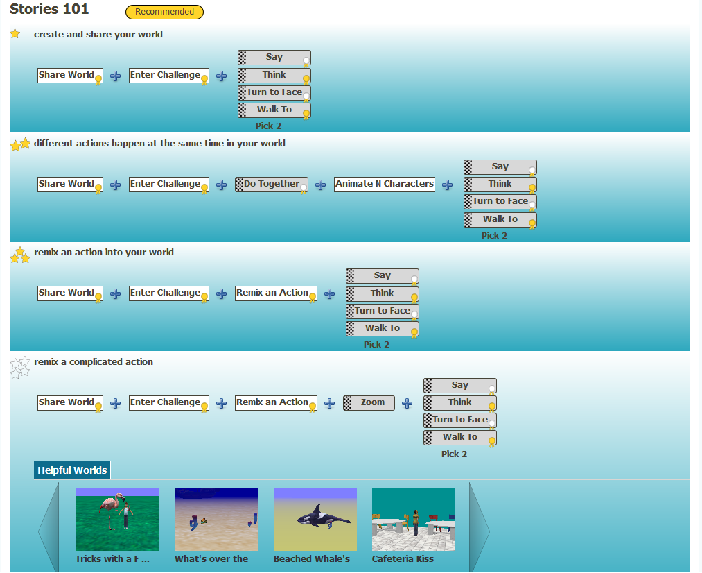
Along the same line, here is where I am with the page at this time:

What do you think? There are definitely things I would like to change (The outline for the star and the mini-badges needs to be bolder) and things that need to be added (Lightboxes for the skills, clickability to the worlds). But, before I get any further sucked into the minutiae of div formatting, I thought that I would step back and see if there were any points of confusion or suggestions. (For instance, is it apparant which level the user should be concentrating on?)
Reilly Ellis
Reilly is a senior at Washington University in St. Louis. She is majoring in Chinese and minoring in Computer Science and Psychology. Last semester she worked on a wizard tutorial to make it easy...
- Joined Feb 23, 2012
- 37 Posts

Comments
Log In or Sign Up to leave a comment.