

Beautifying Badges
- Jul 26, 2012
- 1 Comment
This week, I worked a lot on the visualization side of badges. I started off by tackling the colored rings that the user can earn after remixing that badge. During the weekly meetings, we’ve had a lot of discussions about make sure that the designs aren’t too subtle. As such, I’m a little concerned that the rings aren’t distinguishable enough from each other (especially silver and platinum). The bronze, silver, gold, platinum paradigm is nice because it corresponds to pre existing levels. However, it may be worthwhile to think about the possibility of another color scheme where the levels would be more visually different.
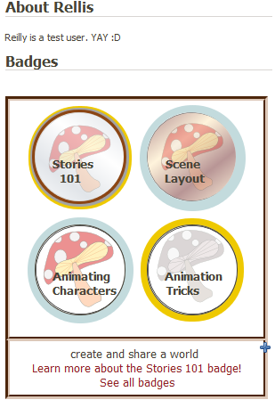
Once I had my badges laid out the way I want them (for now), I added them to the user’s page. The box expands and contracts when you click on the “+” on the bottom right corner. This enables the user to have the option of viewing all the badges without the badges taking up all the space all the time. When you click on the badge image, a box will appear underneath the badges box with a descriptive sentence about the badge level as well as links to that badge’s show page and the badges index page. Initially, I wanted these links to appear on hover over. However, although hover over is really cool, it is also sometimes hard for users to select things from a drop down menu while still hovering over the appropriate container. I did include some hover over functionality, though, to give the user visual clues that the images are “clickable.” (The mouse becomes a hand and the opacity changes).
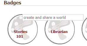
When it came to the badges index page, I made a different design choice. Here, the badge image only had one link (its show page). Therefore, it is easy to just make the link happen on click and the descriptive sentences appear as a tooltip-esq box.
I hope to be able to alter the sentence depending upon the circumstances and who is viewing the page (e.g. “Mary can create and share a world” vs. “You can create a share a world” vs. “Learn to create a share a world”).
I also started on the beginnings of the badges show page. So far, I have laid out the skills necessary to complete each level.
However, when I began thinking about how to alter the display depending upon who is looking at it (e.g. if you have remixed certain skills, they might appear darker), I realized that my organization system for the optional skills (the skill sets where you can choose 1/5 or 2/4, etc) was not up to par. Jordana helped me figure out how to to utilize subclasses to solve my problem. Subclasses should also hopefully enable me to have a prettier system for awarding badges.


Reilly Ellis
Reilly is a senior at Washington University in St. Louis. She is majoring in Chinese and minoring in Computer Science and Psychology. Last semester she worked on a wizard tutorial to make it easy...
- Joined Feb 23, 2012
- 37 Posts

Comments
kyle said:
<p>As always... this is looking really good. FYI... it's really easy to export different image styles from one Inkscape file. So you can create one main background image and then export all the different ring images with that background to separate files. This is actually how they generate icons for the GNOME desktop.</p>
Log In or Sign Up to leave a comment.