A look at the Challenge Window Design
- Apr 16, 2012
- 0 Comments

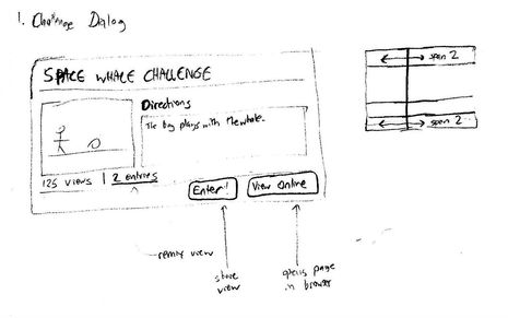
For the the IDE Challenge Window, the goal was to provide a design that would mirror the page you see when viewing a challenge on the Looking Glass community site. You can see in the above design that the presentation of the challenge information is laid out almost identically to the way it is presented on the community.
You can also see some thoughts about how to lay out the panel using Mig Layout as well as notes of how the buttons on the panel are supposed to behave.


Comments
Log In or Sign Up to leave a comment.