

Design Central
- Sep 13, 2012
- 2 Comments
I started out this week by completing the transfer of this summer’s code into the new branch. Jordana and I can now go full steam ahead on badges. You know what that means... design central!
The first thing that I wanted to tackle was the design of the badges themselves. This summer, we played with having one badge per category (e.g. the badge item changes color as the levels advance). If the user earned a remix, the would get a ring in the color of that level around their badge. However, this created a couple of problems:
1. The colors are hard to distinguish
2. What happens if the user skips a level? How do we give the user credit for the higher level while still encouraging the user to earn the middle level(s)?
Potential Solutions
1. Colored Mushrooms
I tried coloring the mushrooms so that their would be white space in between the coin and the ring. However, this didn’t help the coloring blending problem as I had hoped.
2. Remix Ribbon, One Badge/Category
This system pretty much just replaces the remix rings with ribbons. As the user earns levels, the coin changes color and as they earn remixes, the get more ribbons. This system solves the problem of the indistinguishable rings. However, it still has an issue if the user skips a level.


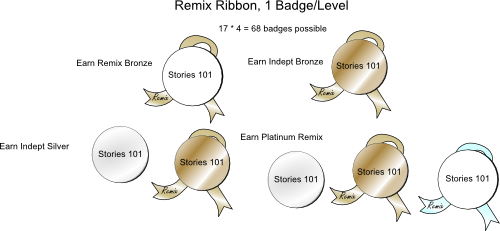
3. Remix Ribbon, 1 Badge/Level
This system gives the user an individual coin per level. If they have remixed the level, they get a remix ribbon and if they earn it independently, the coin changes color. This system is both visually clean, and solves the problem of skipping levels. Moreover, the coin looks naked without either the ribbon or the burnished color. This could further motivate the kids to both remix and earn a level independently.
4. Remix Ribbon, 1 Badge/Remix or Independent
This system is the same as above, only it gives the user a new object every time they earn a level independently or remixed. It solves both of the design problems, but it lacks the added motivation to earn both parts of the level that the above system has. Furthermore, under this system there are a lot of badges possible.
Colors, Colors, Colors
Another potential answer to the blurring colors problem is to abandon the bronze, silver, gold, platinum scheme in favor of four colors that contrast a bit more. However, the potential downside of this is that bronze, silver, gold, platinum is a recognizable progression that another color scheme may lack.
Whew! Congrats on making it through another long-winded blog post. Please let me know any thoughts, comments you have on which badges system you like best. (While you’re at it, what do you think of the mushrooms vs. non-mushrooms on the last photo? Cluttered or cute?)


Reilly Ellis
Reilly is a senior at Washington University in St. Louis. She is majoring in Chinese and minoring in Computer Science and Psychology. Last semester she worked on a wizard tutorial to make it easy...
- Joined Feb 23, 2012
- 37 Posts

Comments
kyle said:
<p>I really like the ribbons and the colors, the metalic ones just don't quite come through on the website! However, I really don't understand the mushroom. I know that we like to utilize things from Alice in Wonderland, however I don't think most of our users get this. From my many partipcants I had during user testing this past month one of the mose common questions I got was why is it called Looking Glass. They have no idea that we are using Alice in Wonderland for names. So I think to them the mushroom may be an extremely odd choice. However, outside of this this ribbons work really well... and I really like the different color levels and the filling in the center if you do it yourself... that is such a good idea!</p>
jordana said:
<p>I could go with either colors or metallic. I think the gold and platinum are really pretty, but the colors are fantastic, too. I personally love the mushrooms, as long as they don't get washed out, but I don't think they're important either. Love idea #3!</p>
Log In or Sign Up to leave a comment.