

Project Proposal
- Jun 15, 2012
- 5 Comments
1) The high level problem(s) I would like to solve or contribute to solving:
How do we support users learning from other users? How can we show a user how to follow in the footsteps of another, more experienced user? How can we make sure that users who are motivated to learn from other users are able to do so at an appropriate pace, such that skills are learned in a logical order? Learning is goal driven – how do we support the formation of new goals?
2) Why it is important for Looking Glass users:
The niche of motivating skill building is fairly unfilled on the Looking Glass website as it stands. Challenges come close because they are likely to spark new story ideas and to get kids programming quickly. However, if a user comes up with an idea but doesn’t know how to execute it, challenges may be insufficient.
A hypothetical Looking Glass user, Jane, may reach a point where her improvement plateaus and she has trouble finding inspiration or isn’t sure what steps to take in order to continue improving. We want Jane to continue to use and learn from Looking Glass and the Community website so that she can continue to hone her programming abilities. For this reason, we need a way to give her good examples of users to emulate; worlds that are within her ability to make, but perhaps use constructs she hasn’t yet discovered or utilized on her own; and challenges from which other, similar users benefitted.
Following a user should prevent Jane from having to routinely check that user’s new worlds and activities, and should instead make the user’s worlds and activities appear more often and more conveniently all over the Looking Glass Community site, as viewed from Jane’s account. The Community site provides us, as researchers, with a unique opportunity. Since we know what steps an advanced user took to get to where he or she is currently (i.e. we know the order in which they shared worlds and earned badges, and we can see how their code creation changed as they progressed), we can help lead less experienced users through similar steps to help them also achieve higher level programming skills.
Also, by following a user, Jane may be [subconsciously] indicating that one of her goals is to become more like that user in terms of creating worlds, challenges, etc. in ways similar to that user. By showing Jane that user’s worlds more frequently, the site enables her to easily find examples to bookmark, remix, and learn from.
3) Specifically what I plan to do (This will include interface sketches and a walk through of how I think it might appear to an end user of the system.)
It makes the most sense to have the following / role modeling system subtly present in all aspects of the site, rather than having an isolated place on the site for users to go and see worlds and activity by the people they [should] admire and thus follow. My proposal therefore involves revamping the users, worlds, and challenges pages. For ease of explanation, I will refer back to Jane, the hypothetical Looking Glass user.
Users
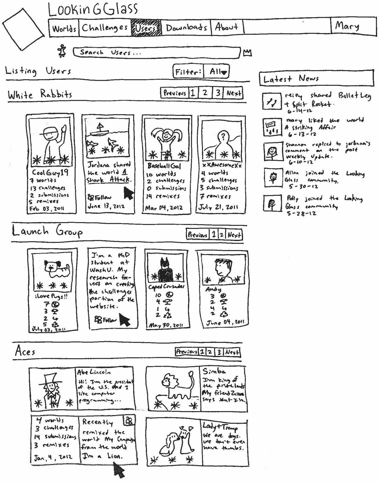
The users index page is currently not very useful. It merely lists all of the users on the site, sorted by various criteria. I would change the users page to display users in three categories.
The first category would be users performing at or slightly above Jane’s level. (User level is based on badges, which have a tiered hierarchy. Users who have completed as many badges as Jane has at the highest level at which Jane has completed badges are her “peers”. Users who have achieved more badges than Jane has at Jane’s current badge level, or who have achieved badges at a level one greater than Jane’s current badge level can be thought of as “performing peers” and are also included in the first group of users. Users at more than one badge level above Jane are not included, as they may be too advanced, and therefore not as good of a role model for Jane.) Given that I won’t immediately have access to badges, since they are in progress as well, I would initially sort the users by the total number of times their worlds had been remixed (since a remix indicates that another user thought that that world had something good to offer). In the sketch, I have labeled this group “White Rabbits”, because in the story, Alice follows the White Rabbit to Wonderland. I’m not attached to the name, but it’s short and seems better than “Users at or slightly above my level, whom I should consider following”, at least until I find a different name for the group.
The second group of users I have [temporarily] named the “Launch Group”. These are users who joined the site around the same time that Jane did. At the moment, I’m thinking a good range might be 3 weeks before and after Jane joined the site, but as more and more users join, we may be able to decrease this range. Multiple people mentioned that it might be good for a user, Jane, to be able to find peers who she could relate to and sort of journey with. I’m not sure if this group will be a good source of motivation or not, and it may need to be tweaked or removed. Jane might find it motivating to see where the other members of her launch group are in terms of badges and skills, but if these users advance much more quickly than Jane does, then seeing them excel may make Jane feel inadequate or discouraged.
The third category of users will be the top performing users. For this I tried to go with playing card references. At present I like the name “Aces”, though I also considered “Kings and Queens”. Again, I’m more than willing to consider better names for any of the categories. These will be the users on the site who are performing at the highest level overall (most high-level badges, greatest number of total badges, most remixers of their worlds, most liked worlds, etc.). This group is useful because it shows Jane what people are able to do with Looking Glass, but doesn’t imply that she should be able to do the same things yet, necessarily.
In the first sketch shown below, I show the users page (filter: all) broken into three categories. I think a horizontal paging ability would be the most useful, since that way you can initially see all three groups, but can scroll through the one you’re interested in at that time. Once you clicked to go to the next page of one of the groups, the view would look more like the second sketch (filter: following) in the sense that you would no longer see all three categories, in order to maximize the ease with which you could scroll through the category of users you’d selected.
SKETCH: users index all
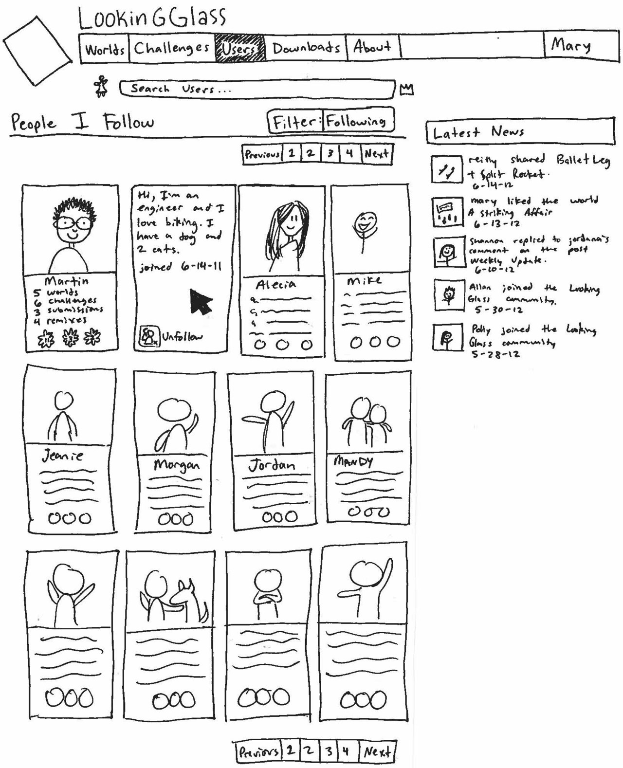
SKETCH: users index following
I think the Community site needs to be more fun looking. Reilly, Genevieve and I talked about it some at our meeting on Wednesday; kids like flashy animations and pretty pictures. The site also needs to make better use of space. White space makes the page seem less cluttered, but lots of white space and text makes it hard to display a lot of information or partials at once, and so limits a user’s ability to quickly locate what he or she is trying to find. Mouse-overs save space by displaying twice as much information in the same amount of screen space, as well as being fun animations that draw the eye and make the website experience more interactive.
The first sketch of the users page shows three different options for how a mouse-over view of the user partial would work. On the actual webpage, all the partials would display the same way, but in the sketch it was easier to show the options all at once. The first way (shown with the White Rabbits) places the user’s picture and stats on the front, and the user’s most recent activity on the mouse-over. Given that playing cards relate to the Alice in Wonderland/ Through the Looking Glass theme, I think it would be cool to style the user partials so that they “flipped” when you mouse-over them, like seeing the back of a card. There are jQuery/javascript examples of flip animations that I could theoretically use shown at the following two sites:
http://lab.smashup.it/flip/ , http://www.scripts.com/viewscript/book-flip-slideshow/3626/ . The second way (shown with the Launch Group) uses picture icons rather than text to display the stats on the front of the card, and has the user’s description on the back. The third (Aces) option is a horizontal layout with the picture and description on the front, and the stats and recent action on the back.
The second sketch shows the users index page when the filter is changed to “following”. I think it is necessary to have a page that simply lists all the users that Jane follows, so that she can easily relocate them in order to access their pages or to unfollow them if she decides she no longer finds them interesting or useful. Followed user partials would have the same mouse-over design as the first view of the users index page.
Worlds
Worlds will be filterable/sort-able by multiple criteria, but only shown in one group at a time. The default listing will be by “magic”, though in my sketches I’ve called that “all”. “Magic” sounds fun, but also like we are hiding some secret formula from the users. Which, I mean, we are, but we don’t have to be obvious about it. However saying “all” implies that sometimes we don’t show all the worlds, regardless of how they’re sorted. My current solution to this is to use the world “filter” (like YouTube does) so that you can change the criterion to sort the worlds or to filter out a group of them, such as “only worlds by users I follow”.
The all/magic filter sorts worlds more or less as discussed in my last blog post. If the user is not signed in, then all the worlds on the site are included, and are sorted by the number and level of badges they fulfill, as well as by how many remixers the world has. If the user Jane is signed in, but is not following any other users and has not set a goal badge, then all we have to go off of is Jane’s current badge levels. In this case, magic/all shows the worlds that fill (at their highest badge level) the badges in the same level as Jane, or one level higher. These are sorted in descending order by the number of appropriate badges affiliated with the world, and also by the number of remixers. If Jane is logged in and follows other users, then their worlds automatically appear in the list before worlds of equal level that are by users that Jane is not following. Worlds that are by people that Jane’s followees (the people she follows) follow get precedence over worlds by people farther than one step away from Jane on a follow tree. If Jane has set a goal badge, worlds that fulfill that badge are ordered before worlds that do not, but otherwise meet the same sort criteria.
SKETCH: worlds index
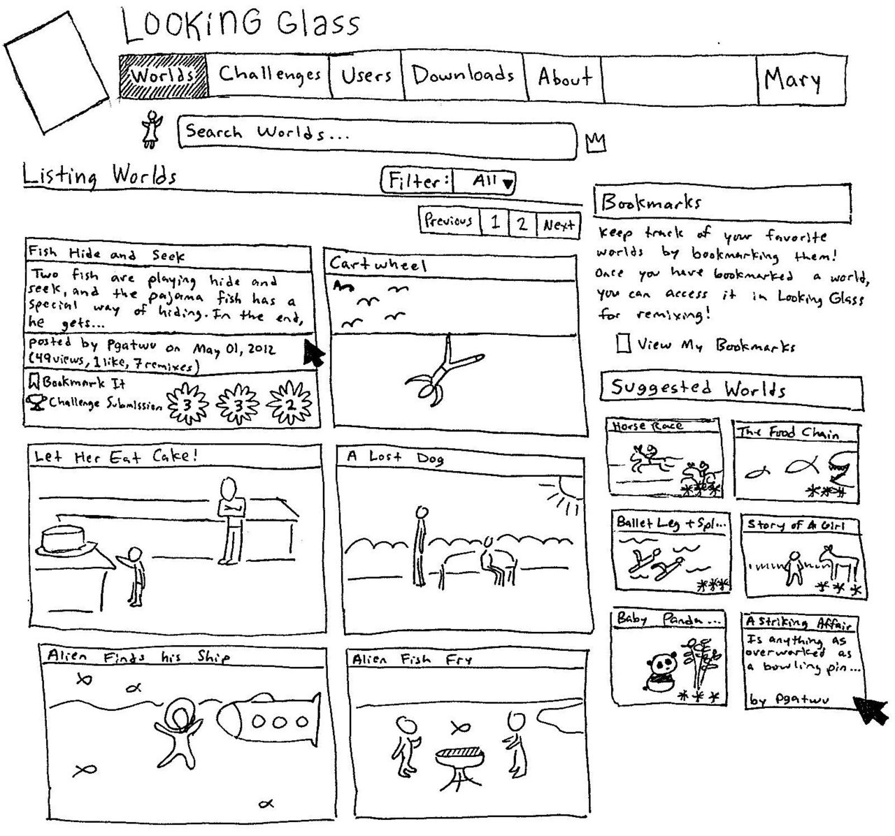
In the sketch above, the filter option is set to “all” which might be called “magic”. The filter metric can be set with a drop down menu selection. The other option on the menu are “remixes” (how many remixer worlds the world has), “following” (created by the people Jane follows), “challenge submissions”, “views”, “likes”, “newest”, “oldest”, and “top worlds” (the best worlds site-wide). “Top worlds” sorts the same way as “all/magic”, except without the requirement that the world’s badges must be at or one level above Jane’s badges. Instead, “top worlds” lists the best of all the worlds on the site. This is important because otherwise Jane may have a hard time finding really excellent worlds. She will be exposed to worlds that are slightly above her level, and therefore provide good “next-step” examples, but she wouldn’t see the site-wide best worlds as often. We don’t want her to miss out on seeing examples of Looking Glass’s best and brightest, so she should have a way to look at great worlds regardless of whether or not she’s prepared to learn from them immediately, and thus I want to include “top worlds” in the filter list as an option.
“Featured worlds” are no longer present in my worlds index page sketch. This is because I don’t think the featured worlds concept can scale to fit the website once it has a significant number of users, all of whom will be at different skill levels. As I understand them, “featured” worlds are statically set as “featured” with an enumeration or Boolean value. This means that someone (be that a moderator, admin, Looking Glass team member, etc.) has to keep track of “featured” worlds and choose appropriate ones. But a featured world for Joe may not be of the appropriate difficulty/skill level for Jane. I think that once the “magic” sorting method is implemented, that there is not a sufficiently compelling argument to keep “featured” worlds, since they cannot be personalized for logged in users of varying ability levels. If others feel that “featured” worlds do still have a place on the site, then I would suggest they be pooled with the “suggested” worlds (which perhaps would be better named “Other Cool Worlds” or something more kid-friendly and exciting), which are present on both the worlds index and show pages, and would be sufficiently present without a place on the main index page world listing.
As mentioned in the Users section of this proposal, I want to make aspects of the site more fun looking and spatially efficient by adding javascript mouse-over animations. (Reilly’s mouse-over badge display was infectious.) The mouse-over view shown in my above sketch puts the thumbnail of a world and its title on the initial view. When moused-over, the image changes to show the world’s description, its creator, the world’s stats, a link to bookmark the world, and the badges that the world fulfills. Having spoken to Reilly (after drawing this sketch in ink), I now think that the badges triad would go on the front thumbnail in the lower right corner, so that users could easily see approximately what badge level each world was at without having to mouse-over the worlds individually. If the world is a challenge submission, that information is displayed near the bookmark link.
Challenges
For a visiting user that has not signed in, challenges are sorted by the number of submissions they have, and by the collective rank of the group of worlds submitted to them. Once a Jane signs in, challenges are ranked the same way, but with their via-submitted-world ranking taking into account what rank of world is recommended for Jane, based on her skill level. If Jane follows users, then challenges created by or entered by large numbers of her followees get higher precedence. If Jane has a goal badge, challenges containing worlds that fulfill that badge (and meet the other requirements listed in the Worlds section to determine good worlds for Jane) are ranked as better challenges for Jane, and so appear higher in the sorted list. The challenge index page seems like a logical way to display challenges (NOTE: I’m moderately biased, having worked with challenges previously.), and after the implementation of this proposal would look drastically different than both the worlds and users index page displays, so I think I would leave the partial alone, and just change the way challenge are sorted. I would however, add a filter drop down menu, as on the worlds and users pages.
Automatically Bookmarking and Following
Despite our efforts to encourage following users and setting goal badges, Jane might be a rebellious child, prone to avoiding behaviors suggested by adults, researchers, and websites. So how can we force her to learn from other users if she decides not to follow them and not to set goal badges?
I want to create automatic bookmarks and followings. Users that we think Jane might like or share interests in would be automatically followed, based on their having an appropriate skill level, their worlds being useful to Jane (as determined by our metrics), and perhaps her having liked a number of their worlds. Worlds and challenges that we deem appropriate for Jane would also be automatically bookmarked. Since bookmarks appear in the IDE as well, Jane would then automatically have a list of worlds we think would be good for her to remix.
If Jane clicked the icon to unbookmark or unfollow an item or user, the system would react appropriately and would then remember not to auto-mark that item or user again for Jane. If Jane manually bookmarked the item or followed the user at some point in the future, it would function as a normal bookmark/follow.
The auto-bookmarks/follows would look and function like their manual parallels, but would have a different background color, perhaps the light yellow that notifications have. This way Jane would understand that the website didn’t have a glitch, and that we are aware that she did not mark those particular items. However, it doesn’t really explain to her that we think she needs guidance and is stubbornly not letting us help her with the free will bookmark/follow systems, so just having a different background color (both Community and IDE –side), might be a gentler way of expressing that the bookmarks and follows were automatic.
Automatic bookmarking and following allows us to steer Jane towards users from which we think she could learn or benefit from observing, even if she does not choose to follow them or to set goals that would lead her to them. The ability to still remove these automatic followings and bookmarks allows Jane to maintain control over her website experience, but only with effortful stubbornness. Auto-marking seems like a good compromise so that we can unobtrusively guide users who aren’t looking for guidance.
In Addition
Since I’m already going to be changing a lot of things with the style sheets and views for worlds, I also want to fix some things on the worlds show page. They’re not entirely pertinent to the following project, but I think they’re important changes to make, in order to make the website experience more enjoyable.
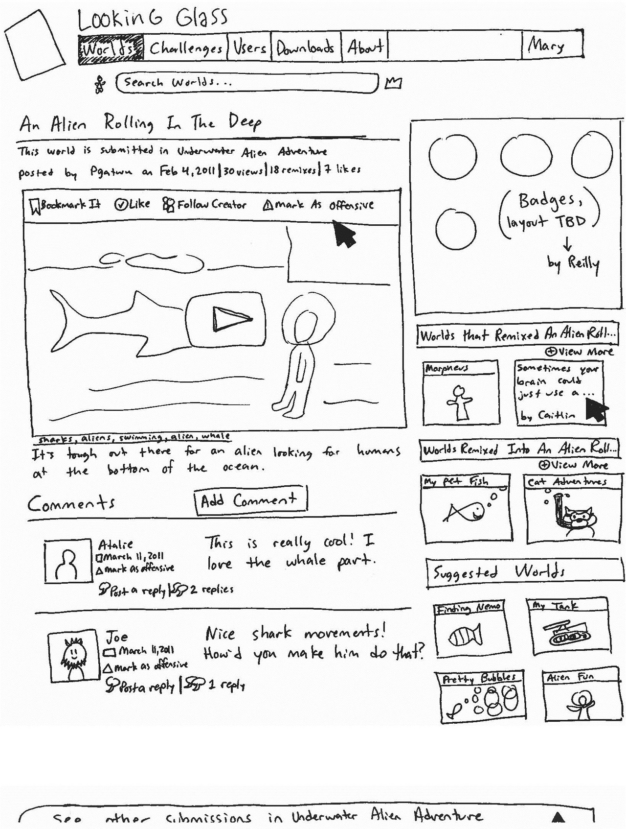
I think (and others have expressed agreement) that the new comment form on the world show page is too large; you can’t actually see any of the comments without scrolling, and so can’t actually tell if there even are comments, which would be worth scrolling down to read. I propose the Add Comment form be collapsed, and only displayed after a user clicks a prominently displayed “Add Comment” button.
My second change to the show page would be to create functionality for the “other submissions” floating bar so that it can be minimized. This was discussed at the time of the bar’s creation and was decided against, but if we’re going to make the site spatially efficient with mouse-overs and whatnot, it makes sense to also remedy the fact that any world submitted in a challenge loses at inch of screen height irrevocably on its show page. The sketch below shows the “other submissions” bar minimized at the bottom of the screen with “See other submissions in [Challenge title]” written on it. The bar would initially be maximized, but if a Jane minimized it, the bar would stay minimized until she navigated away from and back to the worlds show page. I’ll experiment with trying to have the bar stay minimized (until Jane re-expands it) even if Jane navigates away from the world’s show page, or even if she navigates to a different world’s show page, but that might be a reach goal.
Lastly, the sidebar on the worlds page could use some changes. My first, and perhaps most drastic change, would be to remove the “options” box. The mouse-over bar on the world video player has exactly the same options clearly listed. Jane has to mouse-over the video of the world in order to play it, so she can’t help but see the animated bar show up. Furthermore, if she doesn’t play the video (which inherently requires her to mouse-over it), she shouldn’t need to “like” it (or mark it as offensive, etc.), since she would be a poor judge of its content. So I think it’s reasonable to get rid of the “options” box. Reilly intends to do something with badges at the top of the sidebar, as indicated in my sketch, which could make good use of the space formerly occupied by the “options” box. At the planning meeting that Reilly, Genevieve, and I had, we agreed that the remixed and remixer world boxes took up a lot of space. I understand that remix is one of the things we most want to promote on the site, but I think we could do so more spatially conservatively. As on the worlds index page, I think mouse-over views of world thumbnails would be a better way to display “suggested” worlds in the sidebar. Mousing-over the world thumbnail would show a user the creator and description of the world. This sidebar layout would be used on both the worlds index and show pages. Because the thumbnail and description would occupy the same space, we could display two worlds horizontally and conserve vertical sidebar space. That way the “suggested” world box is visible without scrolling, but we don’t lose content in the remixed/remixer world boxes.
SKETCH: worlds show page, submission edited
Mary Chou

Mary, who now goes by the name Ari, graduated in May 2013 from Washington University in St. Louis. In the past she has worked on the Challenges section of the website, with the goal of creating an...
- Joined Feb 23, 2012
- 28 Posts

Comments
kyle said:
<p>I look forward to seeing your sketches. I think you are thinking about this in the right way... this really says it all:</p> <p>"It makes the most sense to have the following / role modeling system subtly present in all aspects of the site, rather than having an isolated place on the site for users to go and see worlds and activity by the people they [should] admire and thus follow."</p> <p>I do think it may be a good idea to try and figure out what groups you want to present on the users page by actually trying to come up with some example users and see if these groups make sense. I'm not really sure at this point... but it seems like a good exercise to actually explore the space.</p> <p>I would also like to point out that I think that "more exciting" webpages for kids can be distracting. I'm not sure that animations are a good idea and I'm very pessimistic about saturated colors... I want us to remember that we are talking about middle school children here. However, I do agree about the white space. I really think we need the background of this site to be a different color (even if the middle is white).</p> <p>You've done a great job thinking through this project and I look forward to seeing the results at the end of the summer.</p>
markatch said:
<p style="margin: 0px 0px 1em; padding: 0px; color: #464337; font-family: 'lucida grande', tahoma, verdana, LgCantarell, sans-serif; font-size: 13px; line-height: 16px; text-align: left;">Replies to comments about my proposal can be found in my next blog post, at:</p> <p style="margin: 0px 0px 1em; padding: 0px; color: #464337; font-family: 'lucida grande', tahoma, verdana, LgCantarell, sans-serif; font-size: 13px; line-height: 16px; text-align: left;"><a>http://lookingglass.wustl.edu/users/markatch/posts/34-re-proposal-comments</a></p>
Log In or Sign Up to leave a comment.