

Getting Down to the Details (Week 9)
- Jul 26, 2012
- 2 Comments
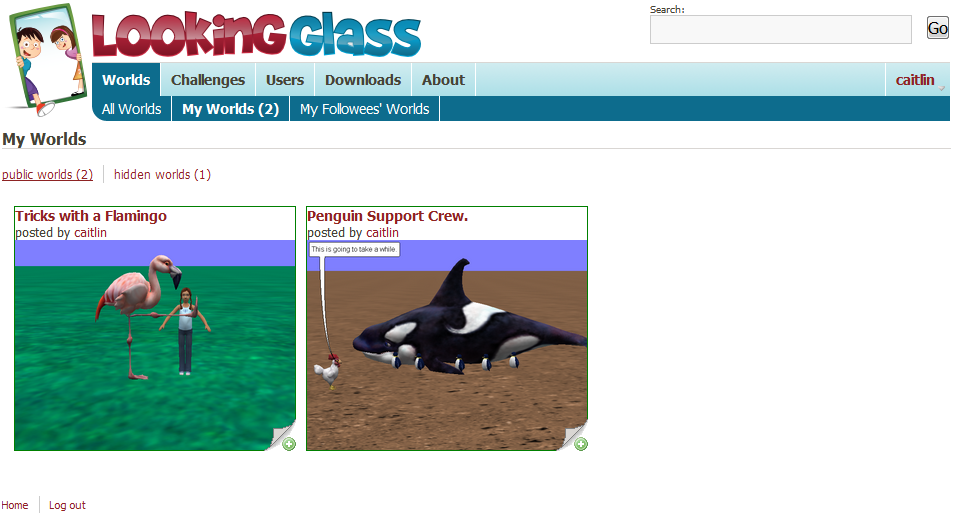
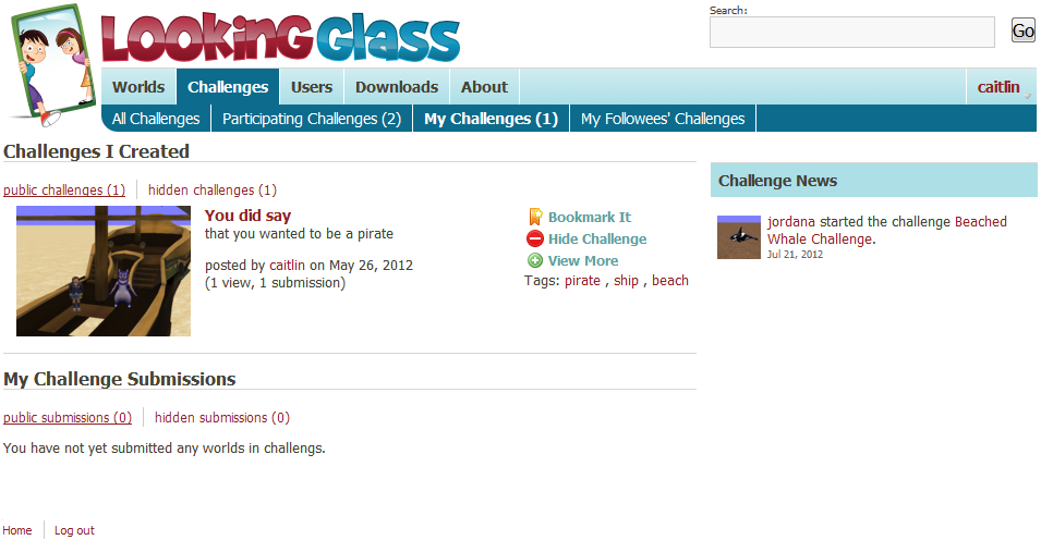
At the group meetings, we have been talking about redesigning the navigation and subnavigation bars, such that the profile drop down elements be incorporated into the main bar. I think a group re-design session will be occurring in the future, but it made sense to me to go ahead and incorporate some of the world and challenge subgroups into the subnav for the main world and challenge sections. I feel like this is relevant to the "improve the overall user experience" part of my project. The worlds subnav now has All Worlds, My Worlds, My Followees' Worlds (which needs a different name, but "By People I Follow" seemed unpleasantly long). The challenges subnav has All Challenges, Participating Challenges, My Challenges, and My Followees' Challenges (again with the needing a better name). The My Challenges tab is further broken up into Challenges I Created and My Challenge Submissions, since despite being worlds, the challenge submissions seemed like they fit best into the challenges section. Where relevant, these subtabs are divided by public and hidden items. I think it makes sense and is useful to have the groups of worlds and challenges created by the people a user follows. That's the whole point of following a user: to be more heavily exposed to their work, so that you can learn from it. Or from the follower's perspective, to gain easier access to the followee's work, and make it easier to find them and their work in the future.
[world subnav picture]
[challenges subnav picture]
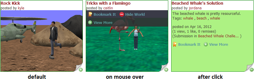
Kyle has repeatedly made the good point that mouse-over actions, while fun and pretty, are not supported on a growing number of devices, such as iPads, smart phones, etc. Because of this, I changed the world partials to utilize both click and hover technology. The remaining mouse-over, while convenient, is not crucial to the partials' functionality. On mouse-over, the world links show up, and when you click on the upturned corner, the picture is replaced by the description, tags, stats, and another set of links (but these are just visible, no hover required). Once I had created the world subnav and had changed the partials to click, rather than just hover, I ran into a bit of a problem: if you clicked to the description on a world, switched subnav tabs, and switched back, that partial jumped horribly out of line. This happened only in Chrome; Firefox worked beautifully, and IE, well, we don't talk about IE. This development led to really fun cascading patterns on the worlds index page, but eventually I managed to fix it by changing more things in the stylesheets.
Another change I made was to give the title and poster area of the world partial a background color. Genevieve and I had talked once about color coding the site: worlds would be green (Yay, plant life, recycling, and being green!), challenges would be red (Challenge! Competition! Aggression!), and users would be blue(Our site is green, red, and blue, and users and blue were both left...). I chose to make the world partial background a light green color, based on the brighter green in the mirror frame (near the boy's hand) in the Looking Glass logo. The title and poster area being green through people off, especially with the hover-links at the top of the thumbnail, so that part went back to being white and just gained a border instead. The background for the description, etc., though, is still green, and I think it should stay that way. User partial cards are light blue, taken from the navigation bar and the box headers. I think when/if challenge partials get redone, they should have red incorporated into them. Also perhaps the show pages for these three classes should have a healthy dose of color added.
[world partial picture]
As per usual, magic sort has been improved since last week (when it functionally debuted). Last week magic sort was working, but was only considering the group of worlds related to a user. This week I fixed it to include the challenges and users related to that user as well, so it is more comprehensive, and weights the site elements more evenly. As discussed at last week's meeting, magic sort, as it is implemented currently, is disgustingly slow and uses lots of arrays. Early next week, Jordana has agreed to help me go through and improve the way the code is written, in order to utilize database queries and active record collections, rather than arrays. Adding magic sort to challenges and users will literally be a matter of copy pasting a few methods from one model to another, and refactoring the variable names and input boolean values. I'm not concerned about this process, but it doesn't make sense to do it until after the code review during which the arrays are scrapped and the sort is improved to run at a respectable speed. Currently, loading the world index page on localhost takes literally about a minute, which is not going to scale well at all.
In my proposal, I mentioned wanting to change the comment form on the world show page, so that it takes up less screen real estate. I did that this week, and now the default comment form is hidden, and just shows a green button that reads "Post a comment". When the user clicks on that button, the new comment form is displayed, and the "Post a comment" button instead reads "Hide comment form".
The plan for next week is to go over magic sort with Jordana (and possibly Kyle?), add it to challenges and users, and make a poster for the symposium. If that all gets done and I have free time, I will work on the users index: thinking of use cases for subgroups that would be helpful to users, making customize-able partial-backs, etc.
Mary Chou

Mary, who now goes by the name Ari, graduated in May 2013 from Washington University in St. Louis. In the past she has worked on the Challenges section of the website, with the goal of creating an...
- Joined Feb 23, 2012
- 28 Posts

Comments
kyle said:
<p>I really like the changes to the sub-navigation menu. I think this makes a lot more sense. I hope to try this out soon!</p> <p>Also, I'm glad to see you worried about our users on other devices that don't have mice. We aren't a company so we don't have the time to make our stuff work on everything under the sun. But I do think it's resonable to take the rule of thumb to not make design decisions which explicitly ignore a large group of people (i.e. iPad users).</p>
Log In or Sign Up to leave a comment.